
I build brands that feel lived in—not just logos, but identities with roots, rhythm, and room to grow. From construction to ranching, I’ve crafted visual systems that honor legacy while creating space for evolution.
My professional work for Zweigart Construction and Turner Ranch reflects this: both are family-owned, multi-generational businesses where trust and reputation matter. Whether I’m designing logos, selecting type, building color palettes, or developing brand guidelines, I focus on storytelling through form. Every mark, every line, every color choice connects back to who the brand is—and who it’s becoming.

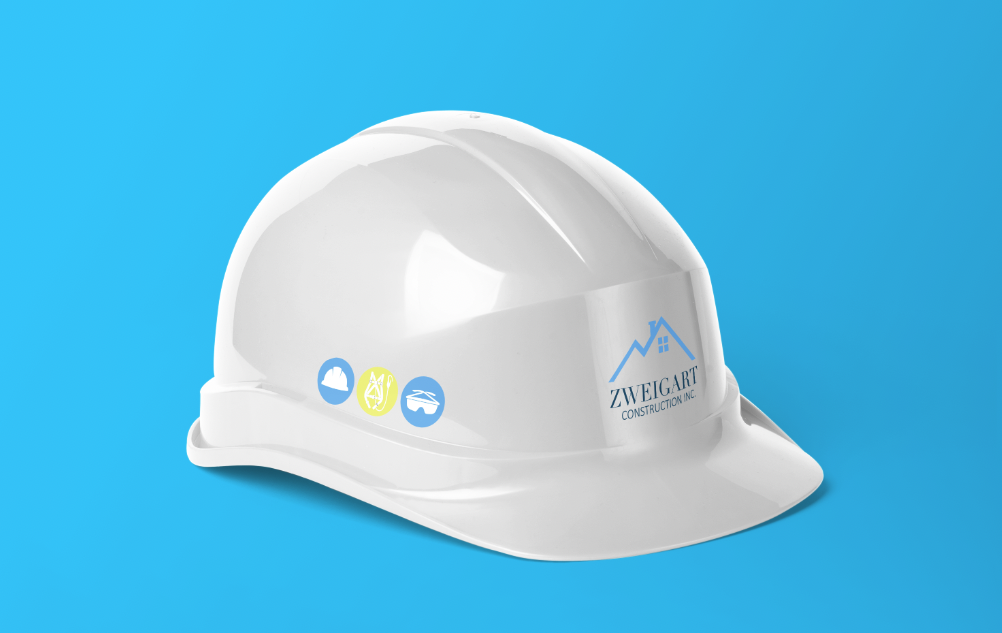
Led the full creative direction for Zweigart Construction’s brand identity, crafting a visual system that reflects the company’s core values of reliability, safety, and professionalism. Developed a bold yet approachable logo system, including a primary icon and supporting icons that communicate key services and values. Selected a strong, calming blue color palette to evoke trust and security—critical elements in the construction industry. Defined the company’s typography to ensure clarity, legibility, and consistency across all platforms. From concept to execution, every design choice was made with the intention to visually reinforce Zweigart’s commitment to quality craftsmanship and safety-first operations.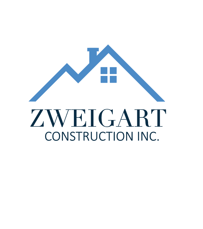
The logo features an extended “Z” that forms a clean, angular roof—symbolizing protection, structure, and long-lasting work. Below it sits the Zweigart name, reinforcing the message: we’ve got you covered. A classic chimney adds a subtle nod to comfort and the feeling of home.

The icon logo simplifies the primary mark into a bold, standalone “Z”, designed for instant recognition. It maintains the brand’s clean, professional feel while staying highly legible across all applications.
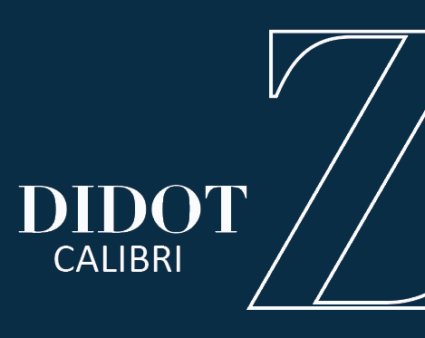
The brand uses a mix of Didot and Calibri—pairing elegance with everyday professionalism. Didot adds a refined, timeless touch that subtly elevates the brand, while Calibri keeps it clean, modern, and highly legible. Together, they balance form and function, creating a type system that’s both trustworthy and adaptable across print, digital, and field-ready materials.

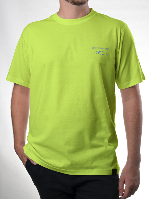
The color palette centers around deep navy blue, symbolizing trust, stability, and the dependable nature of Zweigart’s work. A light blue brings in clarity and calm—echoing the assurance clients feel when projects are in safe hands. A pop of neon yellow nods to high-visibility gear essential on-site, while industrial gray grounds the palette, referencing the tools and materials that keep every job running strong.


Creative Brief – Zweigart Construction Branding
The Ask:
Create a complete brand identity for Zweigart Construction that aligns with traditional construction values while establishing a modern, clean, and professional presence. The brand needed to be instantly recognizable and evoke a sense of safety, trust, and reassurance—key feelings for clients in an industry centered around stability and structural integrity.
Objectives:
Develop a logo and icon system that feels rooted in construction, yet clean and timeless.
Select a color palette that communicates security and professionalism.
Define typography that’s strong, legible, and consistent across all materials.
Ensure every brand touchpoint reflects the company’s commitment to doing the job right—with precision, care, and integrity.
Creative Direction:
Inspired by the dependable nature of construction work, the design leaned into a classic, minimal aesthetic with blue tones symbolizing trust and security. The visual identity was designed to feel solid and grounded, just like the structures Zweigart builds.

Developed a rustic yet refined brand identity for Turner Ranch, centered around a custom crest-style logo that reflects heritage, strength, and the land’s legacy. Created a flexible color palette rooted in natural tones to evoke safety, warmth, and the grounded beauty of the region. Designed a series of everyday icons used for safety and non-danger signage around the ranch—ensuring clear, consistent communication. Chose typography that says, “we’re farmers, but we’re sharp and modern,” blending rural grit with smart, contemporary confidence.
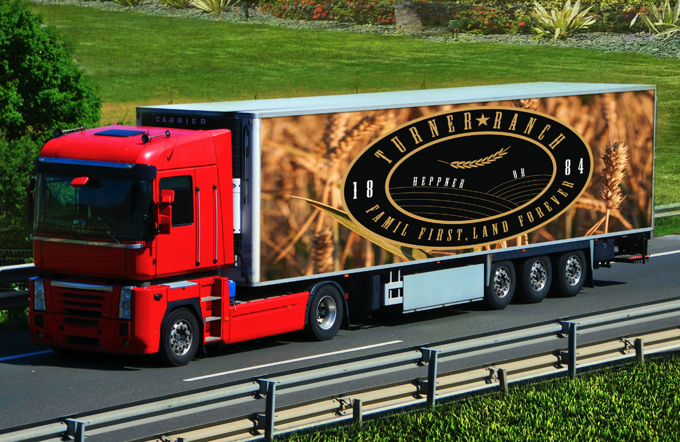
The Turner Ranch logo draws from the vastness of open farmland, using circular shapes to reflect the land’s reach and the idea of a legacy that continues. A wheat plant anchors the center—representing their core crop and connection to the land—while the oval, belt buckle–inspired form nods to Western tradition and rugged durability. Crowning the design is a five-point star, a proud symbol of the five generations that have kept the ranch thriving. The inclusion of the ranch name and a meaningful phrase ties it all together, creating a mark that’s rich in heritage, purpose, and timeless style.
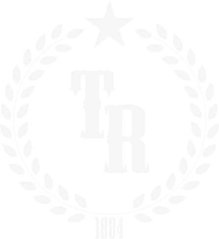
The icon logo was inspired by classic baseball hat designs—bold, simple, and built for everyday wear. A cluster of wheat plants crowns the mark, surrounding a five-point star that honors the five generations the ranch has been thriving. The founding year is proudly featured to ground the logo in its deep history, creating a symbol that’s clean, meaningful, and instantly recognizable.

The typography features Mesquite as the primary typeface—a bold, Western-inspired font that’s rugged yet playful, perfectly capturing the ranch’s personality. Paired with Hatch as a secondary typeface, it brings a more polished, professional edge while keeping the same grounded, meaningful vibe.
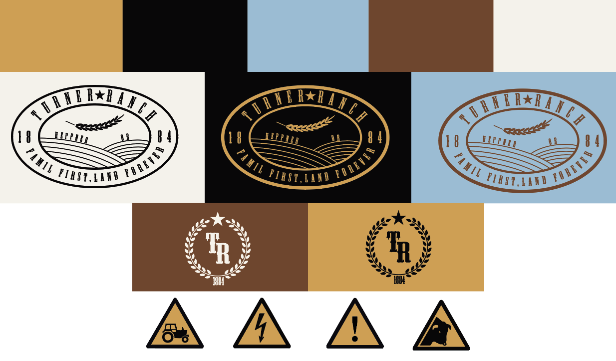
The color palette is rooted in the land and legacy of Turner Ranch. Wheat gold reflects the heart of their harvest, symbolizing the crop that sustains them. Black adds a bold, grounded tone—like the iron tools and branding irons that have shaped ranch life for generations. Sky blue captures the endless horizon over Eastern Oregon, bringing a sense of openness and possibility. Earthy brown represents the leather, soil, and tradition underfoot—honoring the grit it takes to keep a ranch alive. Finally, a warm off-white nods to legacy, like aged parchment or sun-faded barn paint—quiet, enduring, and full of history.

Creative Brief – Turner Ranch Branding
The Ask:
Build a brand identity that proudly represents Turner Ranch’s land, heritage, and connection to the city—while keeping it clean, timeless, and merch-ready. The visual system needed to include a standout crest or icon logo that could be used on hats and gear, tying in the team’s love for baseball and community pride.
Objectives:
Design a logo that blends rural authenticity with simple, strong visual impact.
Develop a crest that nods to sports logos—especially baseball—while staying true to the ranch’s identity.
Choose colors that reflect the local environment and land they care for.
Select typography that balances their farming roots with a modern, capable voice—something that says we work hard, and we know our stuff.
Creative Direction:
The final identity system is grounded in tradition and utility, while also capturing the pride and quiet confidence of a ranch that knows its worth. A mix of natural tones, functional icons, and bold type creates a look that feels both heritage-driven and ready for the future.